Themes
Tippies can have any custom styling via CSS.
#Included themes
The package comes with themes for you to use:
lightlight-bordermaterialtranslucent
They need to be imported separately.
import 'tippy.js/themes/light.css';Pass the theme name as the theme prop:
tippy('button', {
  theme: 'light'
});#Tippy elements
To learn how to create a theme, it's helpful to understand the basic structure of a tippy element:
<div class="tippy-popper">
  <div class="tippy-tooltip" data-placement="top">
    <div class="tippy-content">
      My content
    </div>
  </div>
</div>
A tippy is essentially three nested divs.
tippy-popperis the outermost node. It is what Popper.js uses to position the tippy. You don't need to apply any styles to this element.tippy-tooltipis the actual tooltip node.tippy-contentis the content node.
Depending on the props supplied, there will exist other elements inside it:
<div class="tippy-popper">
  <div class="tippy-tooltip" data-placement="top">
    <div class="tippy-backdrop"></div> <!-- animateFill: true -->
    <div class="tippy-arrow"></div> <!-- arrow: true -->
    <div class="tippy-content">
      My content
    </div>
  </div>
</div>#Creating a theme
Themes are created by including a class on the tippy-tooltip element as part
of a selector in the form .tippy-tooltip.x-theme. Let's demonstrate this by
creating our own theme called tomato:
.tippy-tooltip.tomato-theme {
  background-color: tomato;
  color: yellow;
}
To apply the theme, specify a theme prop without the -theme suffix:
tippy('button', {
  theme: 'tomato'
});#Styling the arrow
There are two types of arrows:
- CSS arrows (using
border-width) - SVG arrows (using an
<svg>element)
#CSS arrow
To style the default CSS arrow, you'll need to target each different base
placement using the data-placement attribute and apply it to the
.tippy-arrow element:
.tippy-tooltip.tomato-theme[data-placement^='top'] .tippy-arrow {
  border-top-color: tomato;
}
.tippy-tooltip.tomato-theme[data-placement^='bottom'] .tippy-arrow {
  border-bottom-color: tomato;
}
.tippy-tooltip.tomato-theme[data-placement^='left'] .tippy-arrow {
  border-left-color: tomato;
}
.tippy-tooltip.tomato-theme[data-placement^='right'] .tippy-arrow {
  border-right-color: tomato;
}#SVG arrow
First import the svg-arrow.css stylesheet for SVG arrow styling:
import 'tippy.js/dist/svg-arrow.css';To color an SVG arrow, specify fill and target .tippy-svg-arrow:
.tippy-tooltip.tomato-theme .tippy-svg-arrow {
  fill: tomato;
}
The shape isn't dependent on the placement for styling, which is why it doesn't require the CSS arrow's more verbose styles.
There is a default round arrow SVG shape exported from the package for you to use.
#CDN (iife)
tippy(targets, {
  arrow: tippy.roundArrow
});#Node (esm or cjs)
import {roundArrow} from 'tippy.js';

tippy(targets, {
  arrow: roundArrow
});#Changing the arrow size
#Option 1: transform: scale()
This is the easiest technique and works for most cases:
.tippy-tooltip.tomato-theme .tippy-arrow {
  transform: scale(1.5);
}#Option 2: Pixel increase
If your tippy theme has a border (e.g. the included light-border theme),
then the transform: scale() technique distorts the border width of the arrow.
Instead, you will need to change the size of the arrow in pixels directly.
You will also need to change the size of the border pseudo-elements (::before
and ::after) as well. It's recommended to investigate the CSS of the arrow via
DevTools.
.tippy-tooltip.tomato-theme[data-placement^='top'] .tippy-arrow {
  border-width: 12px 12px 0;
  border-top-color: tomato;
}

/* And so on for each placement... */#Browser DevTools
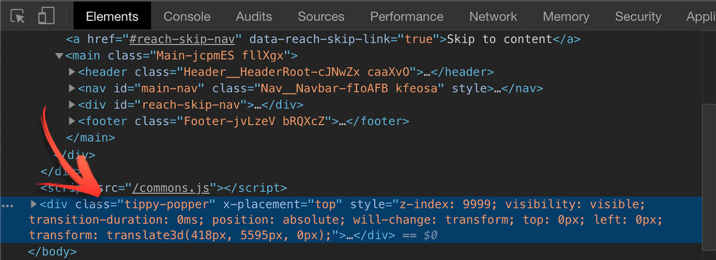
It's highly recommended you inspect a tippy element via your browser's DevTools.
An easy way to do this is to give it hideOnClick: false and trigger: 'click'
props so that it stays visible when focus is switched to the DevTools window.
The tippy element gets appended to the very end of the <body>, so you should
scroll down the elements panel. If interactive: true, then the tippy is
appended to the reference element's parentNode instead.